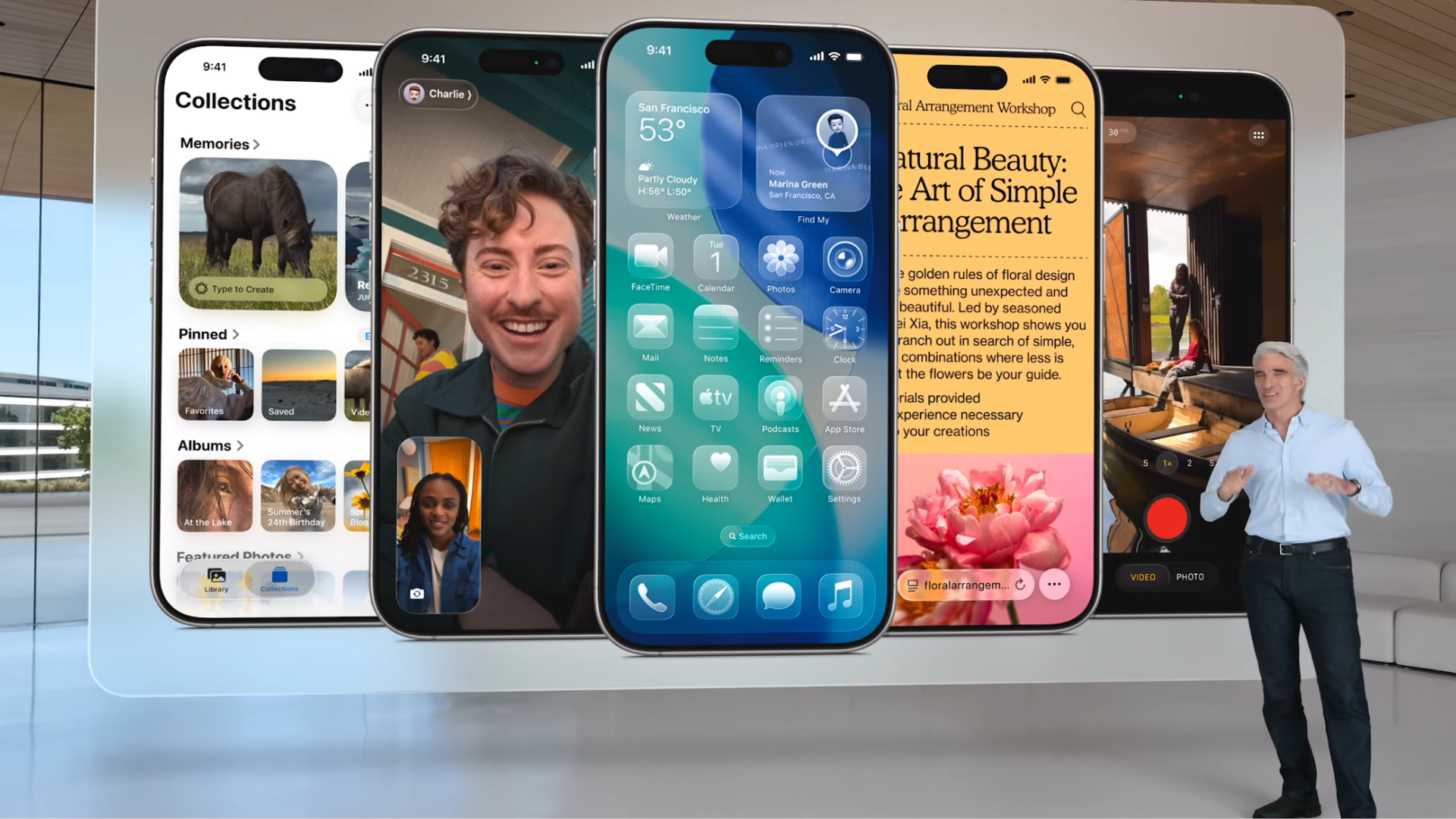
Apple is introducing a bold new look to all of its operating systems this fall. But this isn’t the first time the company has introduced drastic changes that have reshaped the way its software looks and feels. In fact, the company has a bit of a thing for it.
iOS 7 Turned Transparency Up to 11
iOS 7 was the first major design upgrade to the iPhone’s operating system, and it set the foundation for how it would look and work for years to come.
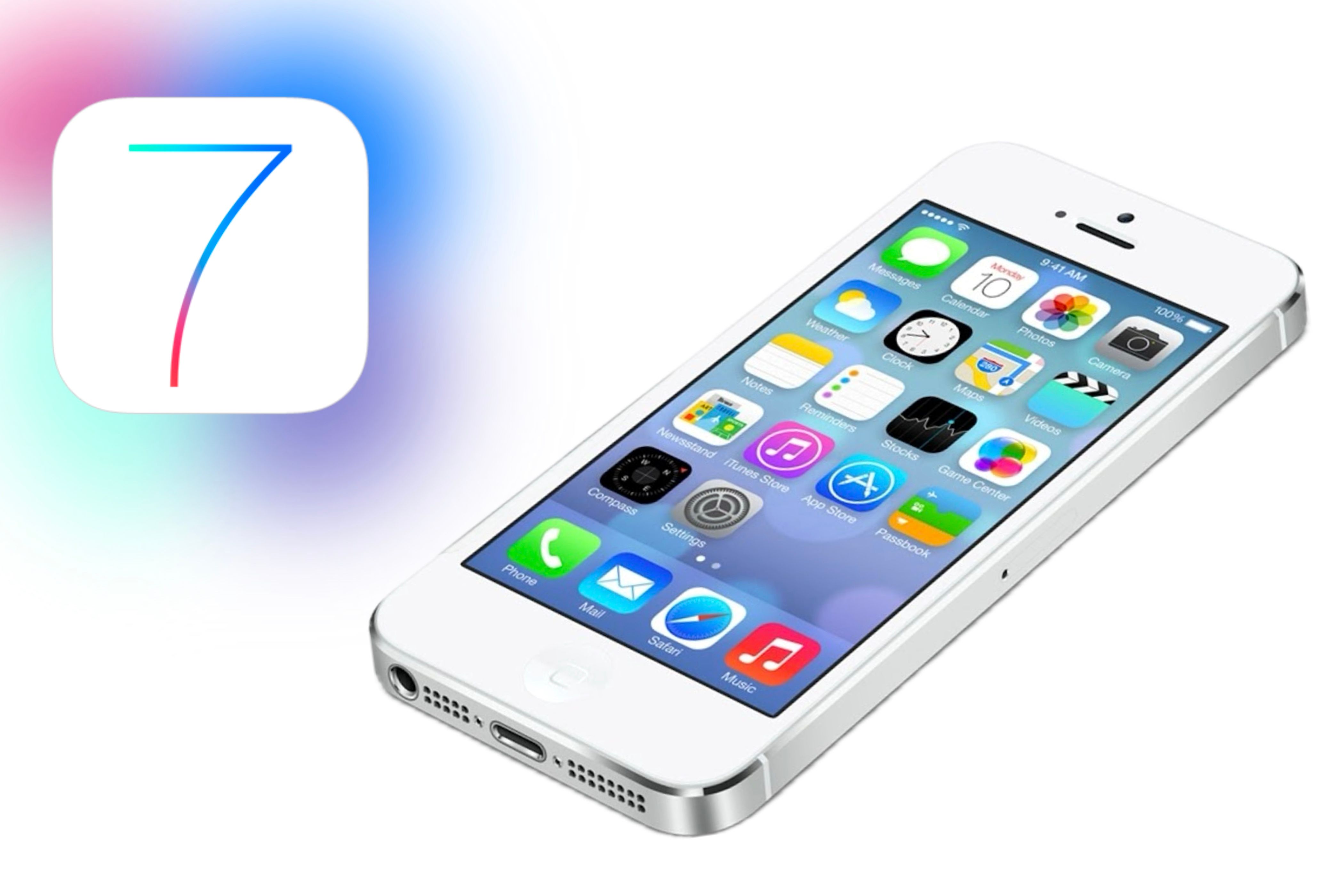
I remember when iOS 7 was released to the public, and the wait time for it to install was insanely long since so many people had tried to download it simultaneously. Yet after finally getting it installed, you truly felt like you were getting and using a new phone.
The main appeal of iOS 7 was that it brought a whole new user experience. Unlike iOS 6 and earlier versions, iOS 7 introduced a flat, more colorful design focused on simplifying usability, increasing transparency, and streamlining tasks across the entire operating system.
Each app was redesigned to match the new aesthetic, and gestures like swipe-back—the motion that lets you swipe from the left edge of the screen to return to the previous page—were introduced.
Control Center was also introduced in iOS 7, marking its first appearance and allowing users to quickly access essential controls—such as music, Wi-Fi, Bluetooth, and more—from anywhere on the iPhone. It didn’t matter if your phone was locked or not, or which app you were using; you could access the Control Center from there.
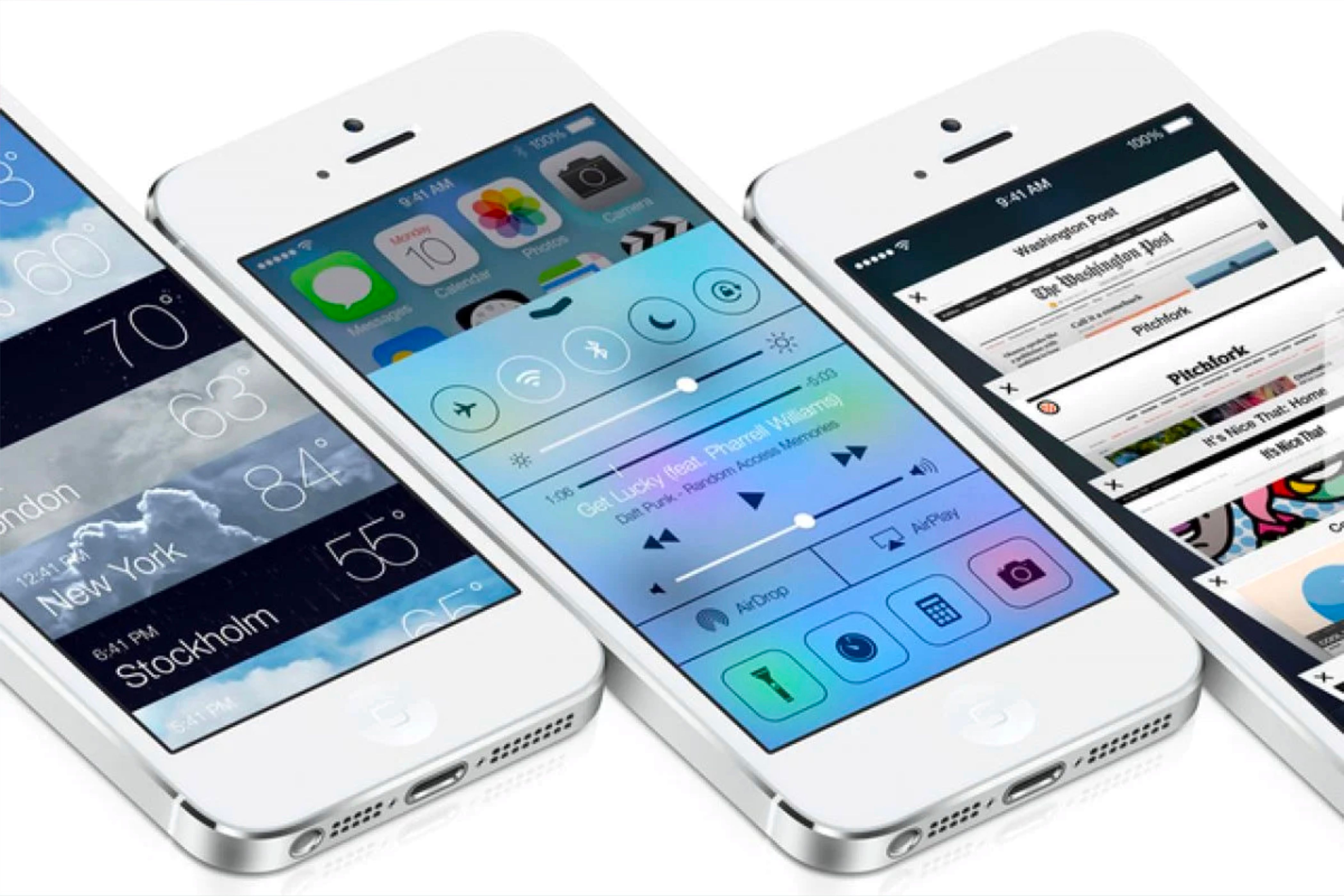
While some apps have been redesigned since iOS 7, like the App Store in iOS 11, this version of iOS set the groundwork for how the iPhone and iPad would operate for years to come. It introduced a new generation of device interaction, and although iOS has undergone numerous tweaks and refinements over the years, the foundation laid by iOS 7 still shines through.
This version wasn’t just an update; it marked a new direction for Apple in its approach to operating systems, both on the iPhone and iPad and in current and future devices.
iOS 11 Made the iPad Stand Out
While iOS 11 wasn’t as big of a redesign as iOS 7, it brought a major usability change to one device: the iPad. With this version of iOS, the iPad began transitioning into how we use it today and shifted its position when comparing the differences between an iPhone, an iPad, and a Mac.
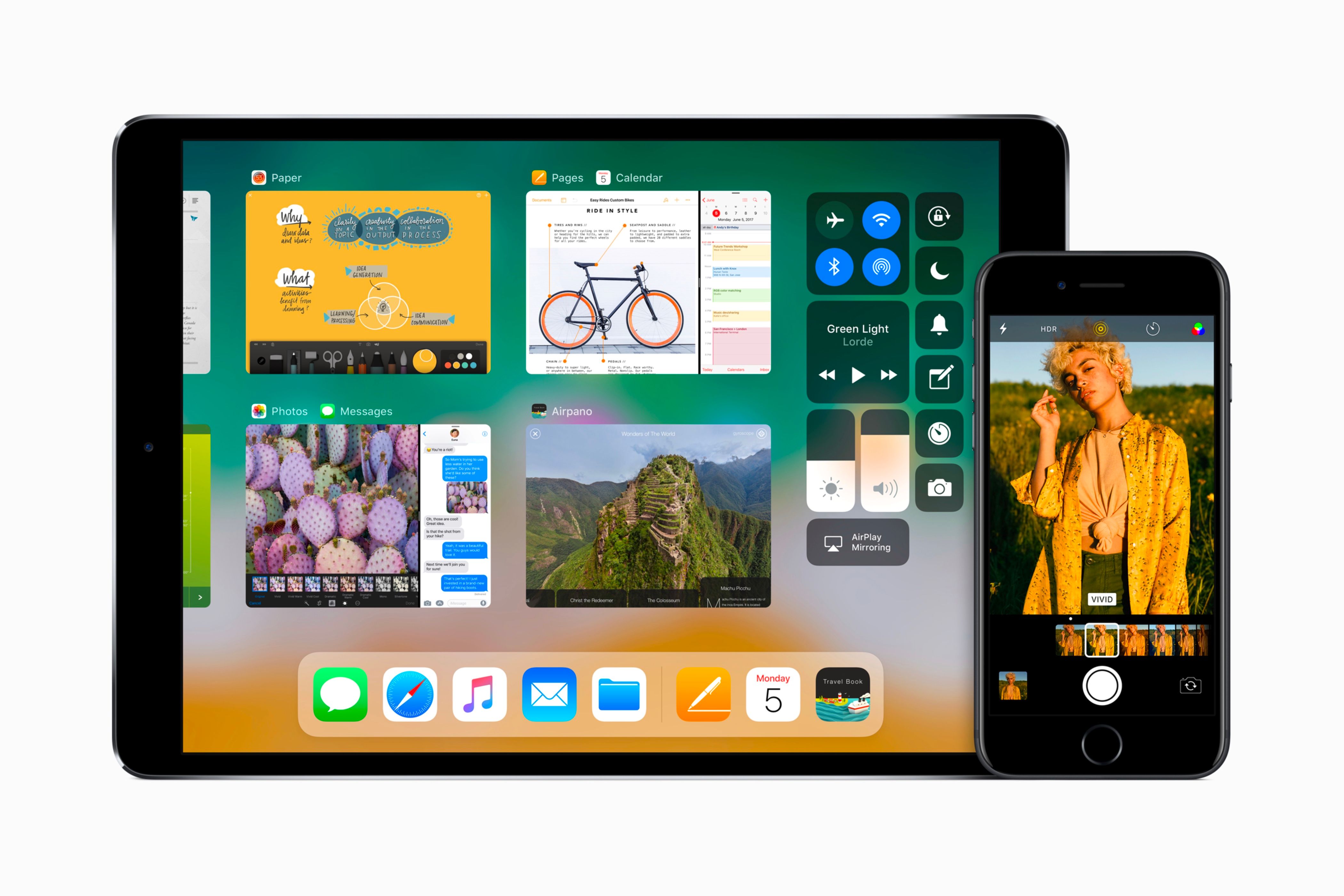
iPadOS was not introduced officially until 2019, when iPadOS 13 was introduced. This was the first time an operating system was solely focused on what the iPad’s capabilities could achieve. However, it can be argued that iOS 11 marked the birth of iPadOS because of its specific additions to the platform solely for the iPad.
People had been asking Apple to make it more Mac-like for years since the iPad was released. They loved the big display and touch interface but it always felt like the device was being held back by an operating system designed originally for the iPhone.
With iOS 11, Apple finally brought popular Mac features to the iPad that many people have been waiting for. These included a new Files app and allowing you to drag and drop pictures and documents between apps.
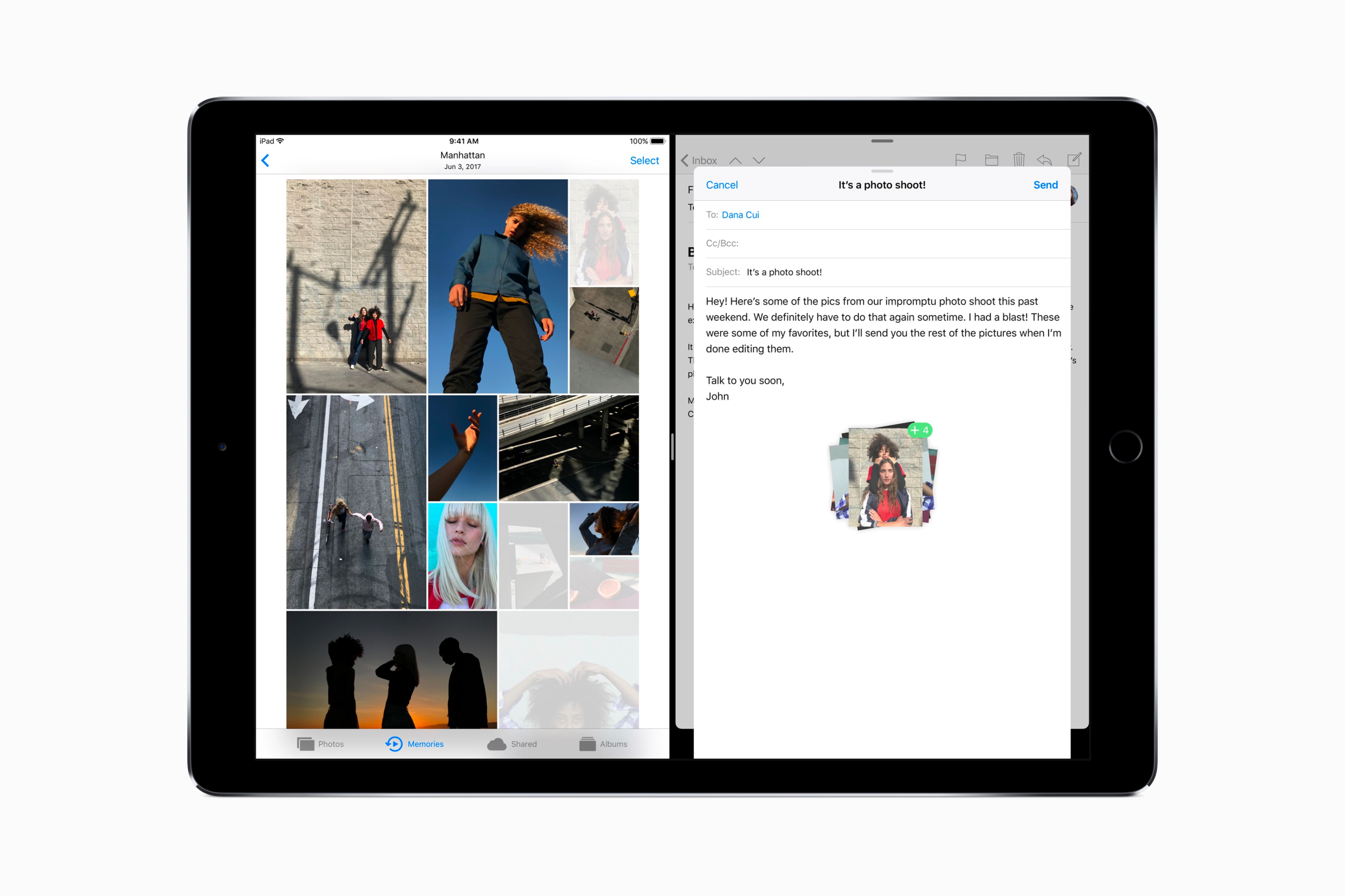
Additionally, Apple significantly upgraded the dock in iOS 11 for the iPad, allowing it to function more like the Mac. You could add many more apps to the dock and summon it from anywhere by swiping up from the bottom.
This version of iOS also marked the beginning of Apple’s “What’s a computer” campaign, showcasing what could now be done with an iPad. This included showing how you could be more efficient at completing work and tasks, all with a swipe and a tap.
iOS 11 marked the birth of what would become iPadOS and upgraded the iPad’s image as more than just a bigger iPhone, firmly positioning it as a productivity device that offered the best of both an iPhone and a Mac.
iOS 14 Emphasized Customization Like Never Before
Like iOS 11, iOS 14 did not provide the major redesign iOS 7 brought, but it did bring the most significant change in how our iPhones look. This version of iOS could be seen as the first version that allows iPhones to look drastically different from one another, depending on the person using them.
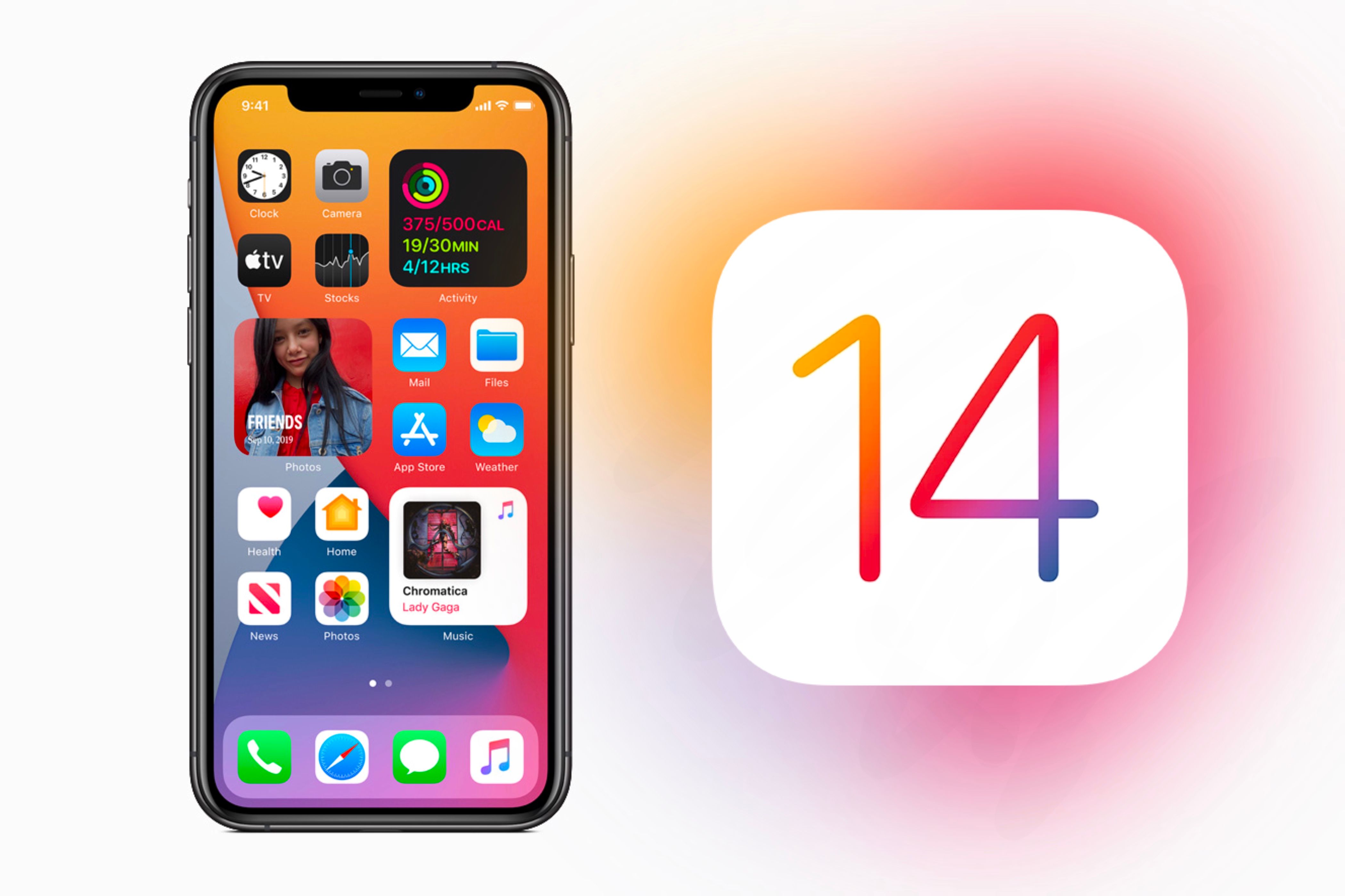
For example, before iOS 14, all iPhones typically looked the same, with the same six rows and five apps per row. The most available customization was deciding which apps went on which page.
Yet, with iOS 14, users could add widgets to the Home Screen and customize them to their liking. Each page no longer had to consist solely of apps; it could be personalized with a mix of apps and widgets to make each one unique.
Furthermore, adding widgets allowed you to use third-party apps to customize your Home Screen further. Since you can change the icons of apps through Siri Shortcuts, you can give each page a distinct look based on a specific theme.
iOS 14 also introduced ways to change how you access apps, especially ones you don’t want on your Home Screen. With the inclusion of the App Library, you could have all your apps in one spot, intelligently organized by the category they fit into best.
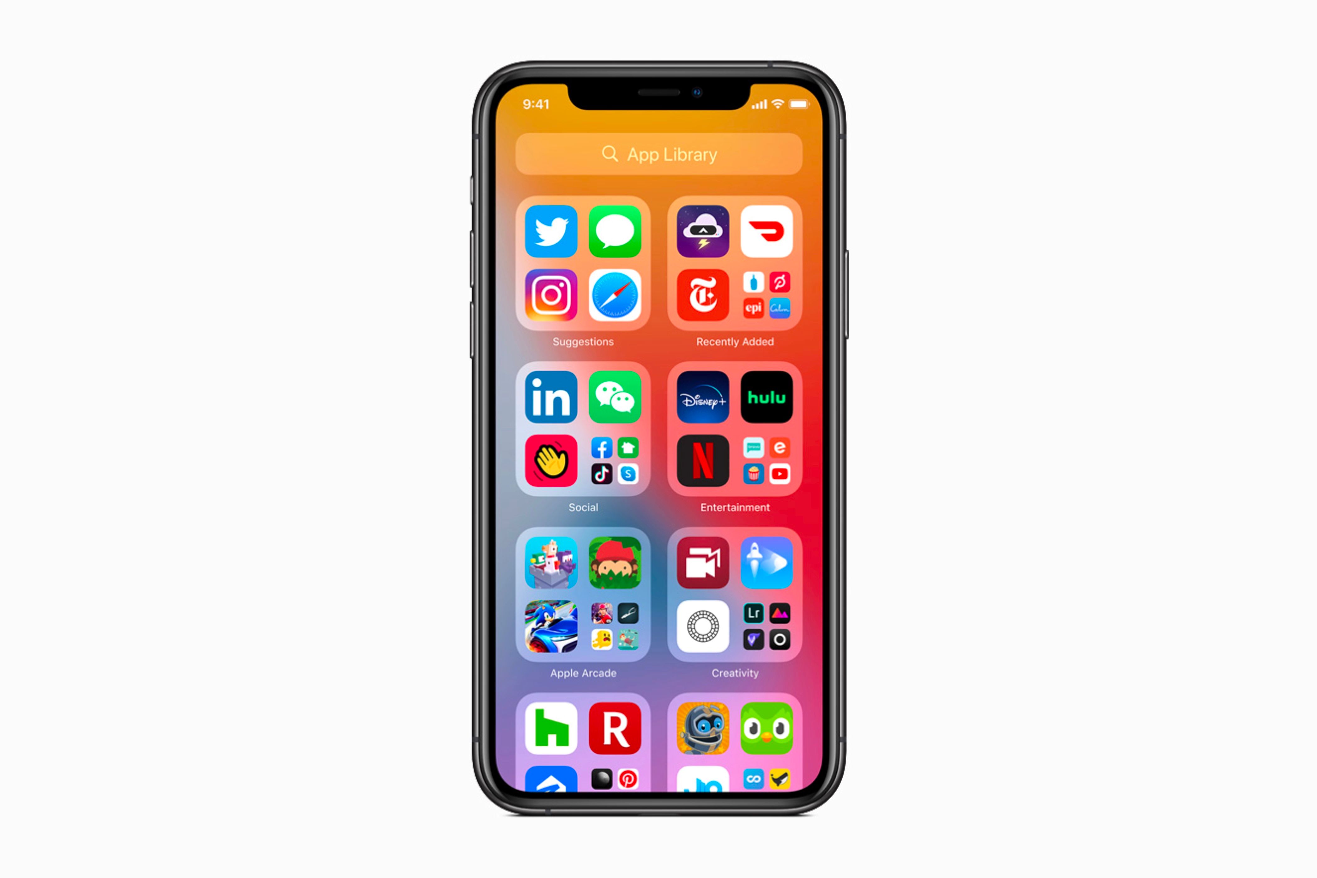
This essentially allowed you to hide apps from the Home Screen without deleting them. The apps would live solely in the App Library.
Additionally, not only could you hide apps in the App Library, but you could also hide entire Home Screen pages. If you didn’t want to hide apps in the App Library individually, you could simply hide a whole page and bring it back when needed.
On paper, iOS 14 might not seem like a significant update. Still, considering the opportunities it brought for deep Home Screen customization, it truly laid the foundation for personalizing your iPhone beyond just the apps on the screen.
OS X Beautified the Mac Desktop
New Mac users may not be familiar with OS X, but the update transformed how the Mac looked and functioned for years to come. The features it introduced are still widely used today and continue to be updated as needed.
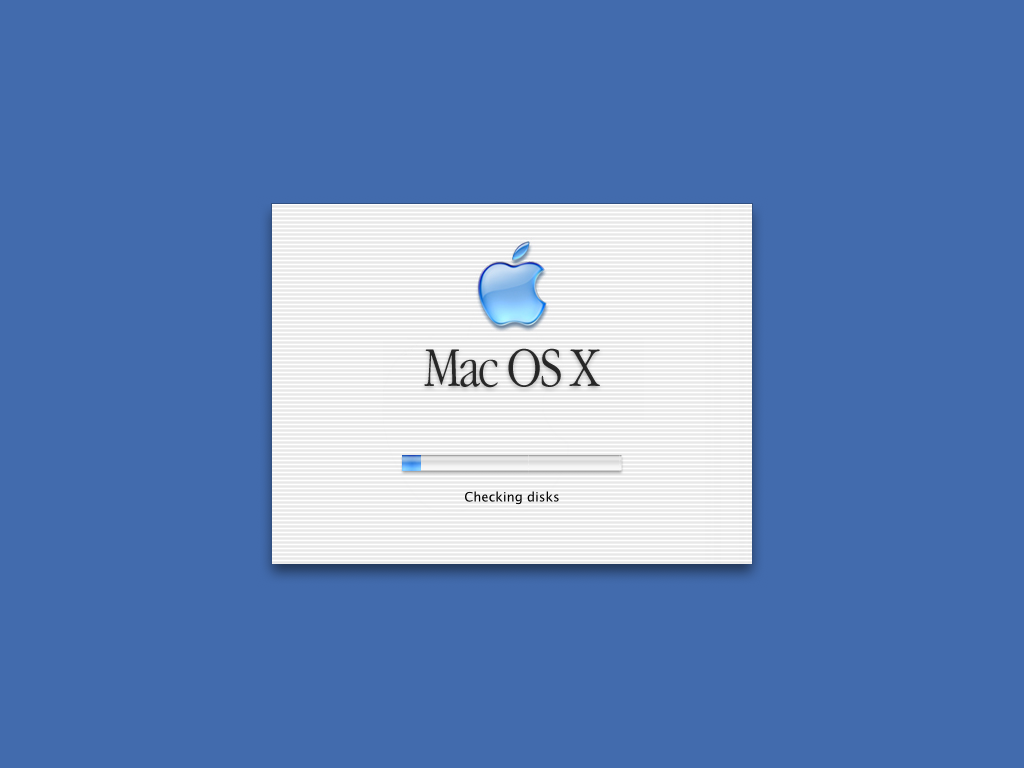
The architecture for OS X was a modern kernel called Darwin. This kernel was open-source and compatible with high-resolution graphics. It also brought essential components and infrastructure to Apple’s current operating systems, even over twenty years later.
One of OS X's most significant additions was its introduction of a visual redesign called “Aqua.” This gave new appearances like drop shadows beneath windows, icon magnification, and high-resolution icons.
Apple’s goal with Aqua was to incorporate color, depth, translucence, and complex textures to enhance the visual appeal of applications on the Mac. The company was so proud of the design that Steve Jobs famously said, “We made the buttons on the screen look so good you’ll want to lick them.” OS X also introduced the dock to the Mac, allowing users then—and still today—to launch multiple apps from a single destination easily. This was a direct response to the taskbar on Windows devices at the time.
Many of these features, such as the dock and Darwin, are still used today across various devices. Additionally, features that originated on the Mac—like the dock—have since made their way to other platforms, such as the iPad.
While some of these features are no longer widely mentioned, they still affect how Apple develops, operates, and designs its products. Current design elements are often compared to them—for example, people draw parallels between Liquid Glass and Aqua.
Apple envisioned OS X not just as an annual update but as a foundation for years to come—and it delivered. Much of Apple’s software today stems from what OS X established; without it, Apple may not be the company it is today in terms of software-driven innovation.
macOS Big Sur Brought the Mac and Other Devices Closer Together
After iOS 7 was released, watchOS and tvOS received updates or had user interfaces that matched the operating system’s style. This included app icons, text fonts, and features.
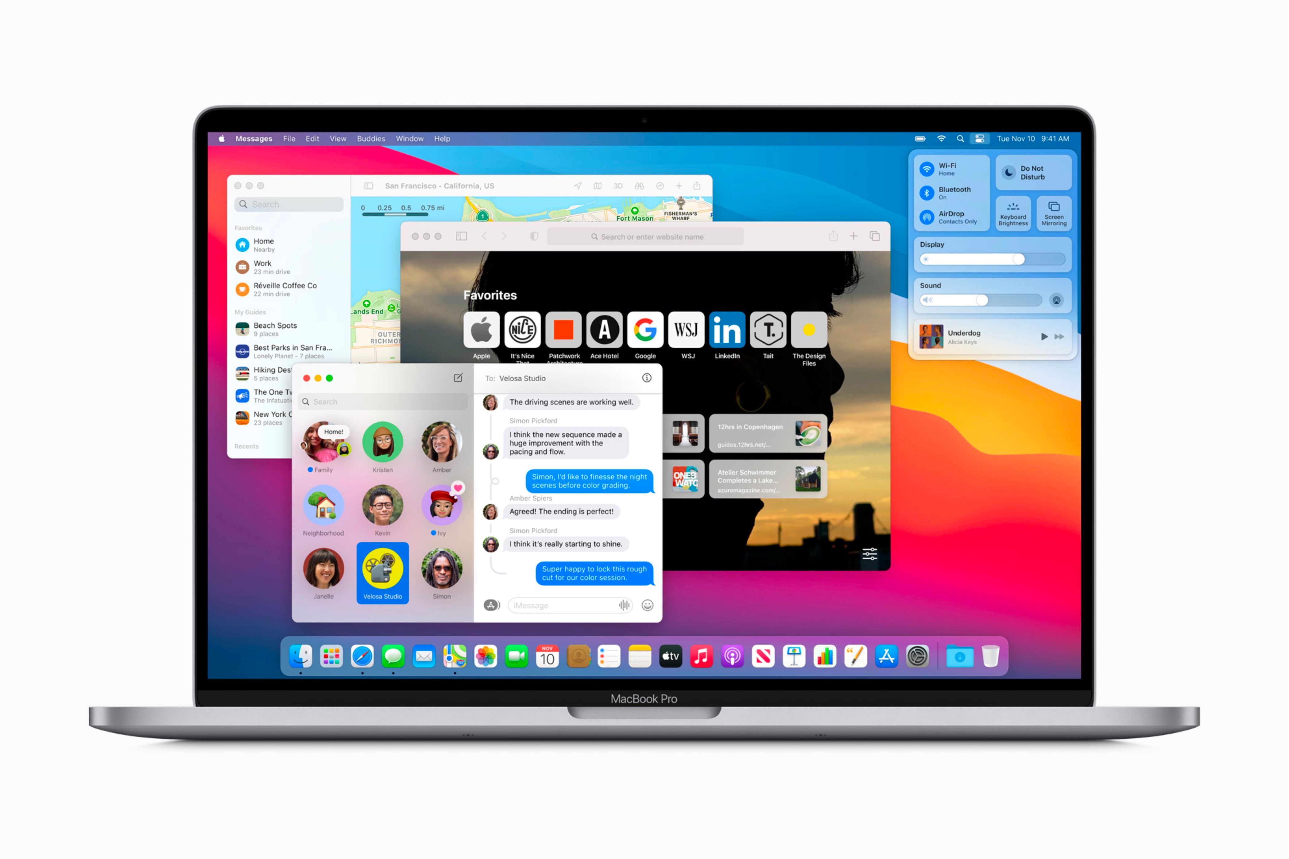
However, macOS still utilized the same user interface with little to no change. That changed with the release of macOS Big Sur, which finally brought the operating system more in line with Apple’s other platforms through similar app designs and shared features.
Just as the iPhone's Retina display influenced iOS 7, macOS Big Sur was a significant update that coincided with Apple’s transition to its in-house silicon, M-series chips. This marked the beginning of Apple controlling the entire product from the inside out, setting the stage for faster and more efficient Macs.
While this macOS version is often compared to the iPhone’s iOS 7 transition, it can also be seen as the first major step in Apple unifying its ecosystem through design. But it wasn’t just about design—features like pinned conversations in Messages and the addition of Control Center mirrored functionality found on iOS.
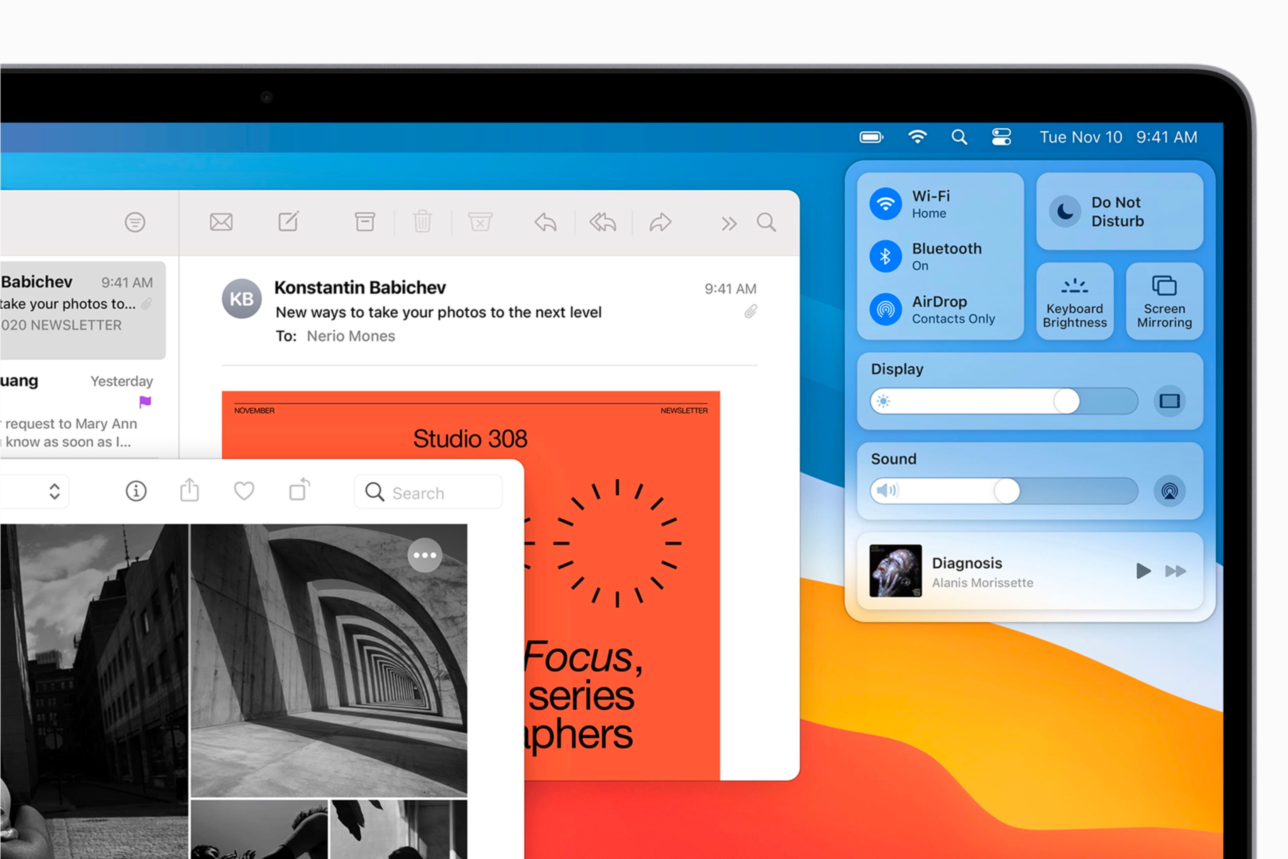
Additionally, macOS Big Sur is viewed more as a future-proof update than a feature-focused one. Apple used it to set the stage for its operating systems to mirror one another and feel familiar, no matter which device you use.
Like with the iPhone, where Apple makes both the hardware and the chips, the company began to do the same with Macs. macOS Big Sur served as a preview of what was coming, showing that Apple was starting to unify its inside-out ecosystem across all its products by moving to M-series chips on the Mac.
Liquid Glass Is Apple's Next Design Evolution
When OS 26—consisting of iOS 26, iPadOS 26, macOS 26, tvOS 26, and watchOS 26—comes out in the fall, Apple will have officially made its whole ecosystem unified in design. While it is very much unified currently, this will be the first year that all operating system updates will get similar looks simultaneously.
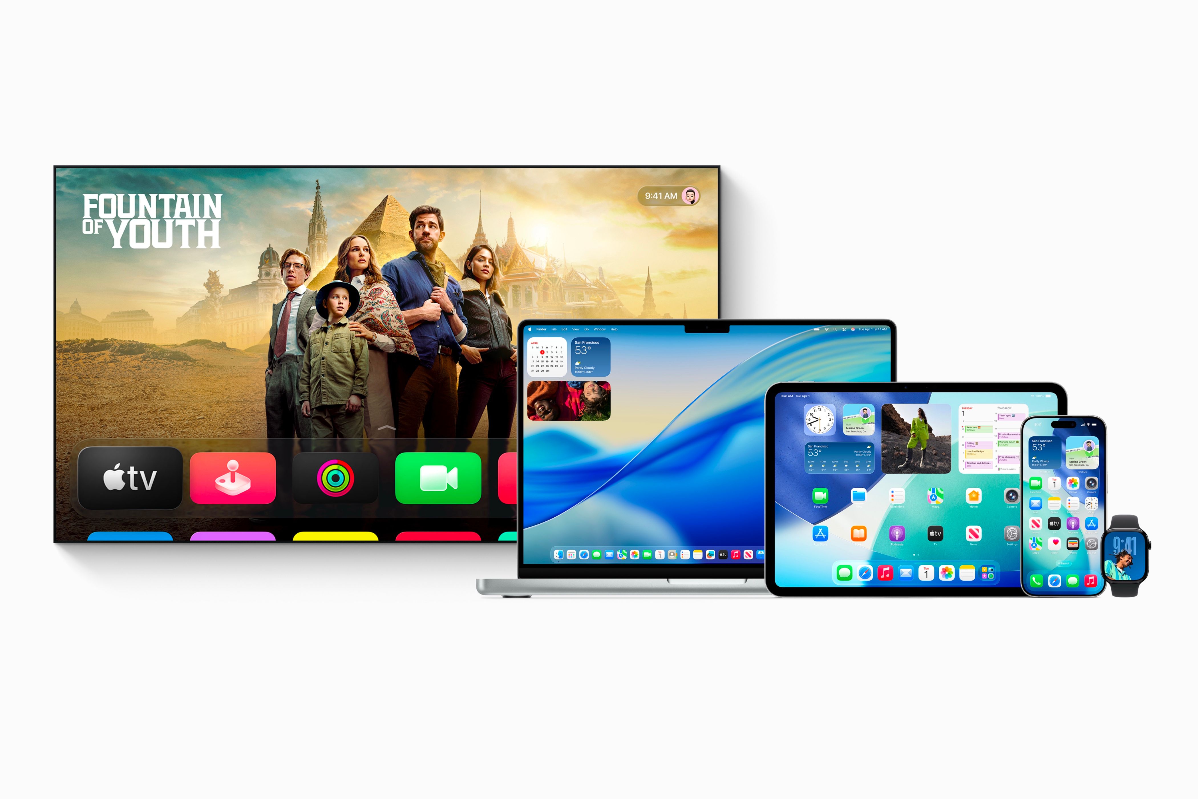
Liquid Glass, the center of each new operating system’s look, is about to follow in the footsteps of every other major design update Apple has implemented. This means that different elements of its design may change over time, and the way apps and animations look now will change.
Yet, just like with iOS 7, the foundation of the design will still shine throughout the operating system, no matter which updates and changes are implemented.
No matter how big or small a feature is, it will become iconic if it fundamentally changes how the device looks, feels, or is used. Apple is about to enter the next era for its operating systems with OS 26, and if history repeats itself, this will be the foundation of Apple's image for years to come.


