Summary
- Google Phone app gets Material 3 design update for Android 16 with improved call screen and new favorites bar.
- Call log is now simpler, easier to view chronologically & see multiple calls from the same number.
- Changes based on user feedback aim to avoid accidental declines/answers.
Last month, it was discovered that Google was working on some big changes for the Phone app. Now that Android 16 is available, we're getting our first look at what those changes look like—and I'm very excited about it.
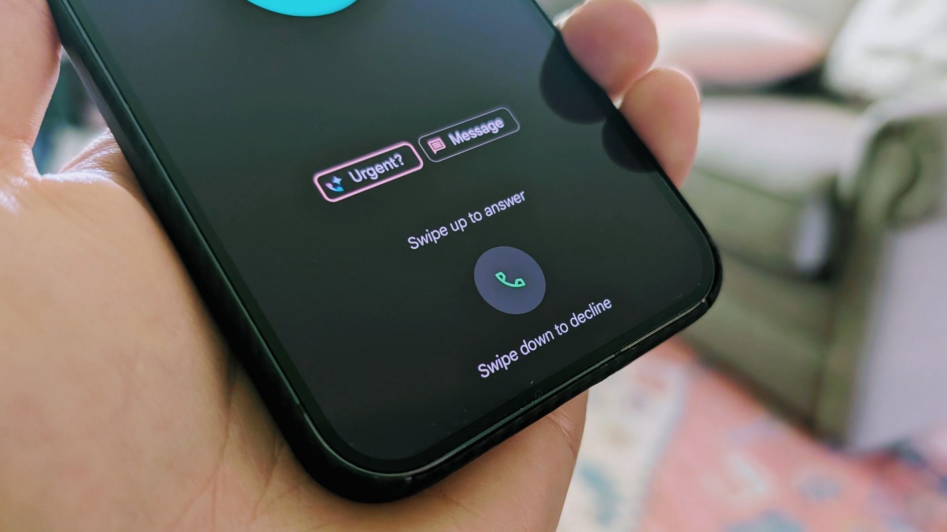
However, in reality, I've always found there to be too little space below the button to swipe down and decline the call fully. It almost always takes me multiple frustrating swipes to do it. Google already solved this problem in the Clock app, which features a horizontal pill-shaped slider to dismiss or snooze alarms. Thankfully, Google is adopting that style for the Phone app, too.
This change is part of the Phone by Google app's Material 3 Expressive update for Android 16. It's currently available if you sign up for the beta in the Play Store. Google says this change was based on user feedback, and it's better for avoiding accidental declines and answers while taking the phone out of your pocket. I just think it's much better all around.
The second nice change is a new favorites bar at the top of the "Home" tab in place of the dedicated "Favorites" tab. The "Recents" tab has also been combined into the new "Home" tab, making things much simpler. You can now see your favorite contacts and all of your call history in one place. The filters for "Missed," "Contacts," "Spam," etc, live at the top of the screen. The "Contacts" tab has been removed entirely.
You may also notice that the call log looks a little simpler. If you get multiple calls from the same number, those are no longer grouped under a single expandable entry. This should make it easier to get an idea of what's going on in chronological order. If someone has called you a bunch of times, that's going to be much more obvious now.
As mentioned, these changes can be found in the latest beta update for the Phone by Google app in the Play Store. While Google said these changes are being tested, it seems likely we'll see them make their way to the stable builds soon enough. Not only is the functionality better, but the look falls in line with Android's new direction.
Source: Google

Google’s Massive Android Redesign Looks Great, But Who Will See It?
Google got a bit ahead of itself and accidentally published a blog post about the massive upcoming Android redesign. It looks fresh, modern, and playful—perfect for the current design trends. But there's a big problem: will enough people actually get to see it?


