


Time for another website update. This time I looked at making some style changes to allow a different view for mobile devices.
My first step was to add the media attribute to the current stylesheet link element. With this set, the style will only be used on computer screens over 1069px. I then created an additional stylesheet called mobile.css. This stylesheet will be used on handheld devices or screens under 1069px. New and updated element below.
...
Once this is done the site switches stylesheets depending on the client browser. However on a mobile phone it looks tiny. This is where the viewpoint element comes in. Adding the following meta element to the head section will optimize the width for mobile devices.
="viewport" content="width=device-width, initial-scale=1, maximum-scale=1" />
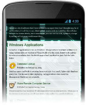
Next is was page navigation. The bar on the left was not ideal for a mobile devices. Instead what I wanted was a menu at the top that would appear and disappear on clicking a new menu button. For this functionality I started looking at the jquery libraries, but finally settled for just a small amount of plain old javascript.
To prepare things, I set the menu style attributes to position:absolute; top:10px, and display:none.
#primary_nav { position:absolute; top:0px; display:none;}
With this set, I created a new menu button that was only visible via the mobile stylesheet.
Once this was completed, it was time to add the javascript below.
function toggleDisplay(_id) { if(document.getElementById(_id).style.display == 'block') { document.getElementById(_id).style.display = 'none'; } else { document.getElementById(_id).style.display = 'block'; } }
That's it, works like a charm.